

Executive Summary
- Website accessibility refers to how well all users, including people with visual, auditory, motor, or cognitive impairments, can navigate and interact with a site.
- Web developers can promote inclusivity and remove barriers for visitors by using proper color contrast, including semantic headings, and offering motion controls.
- Modern tools like the Elementor plugin in WordPress make accessibility easier to implement through features like responsive layouts, animation toggles, and customizable display modes.
- Brands that prioritize website accessibility can lead to stronger engagement and long-term visitor retention, which supports Conversion Rate Optimization (CRO).
Why Website Accessibility Matters for Modern Brands
In the United States, more than 1 in 4 adults reported having a disability or major impairment that impacts their day-to-day lives. As the physical world shifts to meet the needs of these people, digital spaces should as well.
Thankfully, there is a wealth of assistive technologies available for web-browsing that help people with visual impairments, motor limitations, hearing loss, and cognitive or neurological conditions. However, the efficacy of screen readers, keyboard navigation, and voice commands depends on structured, accessible code. If developers don’t include key elements like semantic headings or properly labeled content, these tools become far less effective.
Alienating users is not only unethical; it can hinder the performance of your brand by turning people away before conversion. To help you avoid this, I have compiled a list of website accessibility tools and tips that have helped me promote inclusivity when working in content management systems like WordPress.
Still, before learning how to make a website accessible to everyone, it is important to understand where most webpages stand.
The Current State of Website Accessibility
Unfortunately, despite growing awareness, accessibility gaps remain widespread. In fact, 94.8% of the most popular homepages failed to meet the Web Content Accessibility Guidelines (WCAG) in 2025, causing some users to struggle when trying to complete basic tasks, such as:
- Reading content
- Clicking a button
- Filling out forms
- Navigating menus
These barriers can encourage users to leave before completing a desired action. For the sake of Conversion Rate Optimization (CRO) and general integrity, developers need to identify the sources of friction and nip them in the bud.
Common Website Accessibility Issues
Many accessibility challenges double as general usability problems. Some of the most noteworthy ones I have come across are:
- Low contrast text that makes content difficult to read
- Missing alternative text for images
- Complex layouts that confuse screen reader users
- Excessive animation that disorients users or slows performance
The issues above can cause friction that directly impacts business outcomes by damaging brand perception, increasing bounce rates, and reducing conversions. That is why I always make sure the websites I work on account for common impairments.
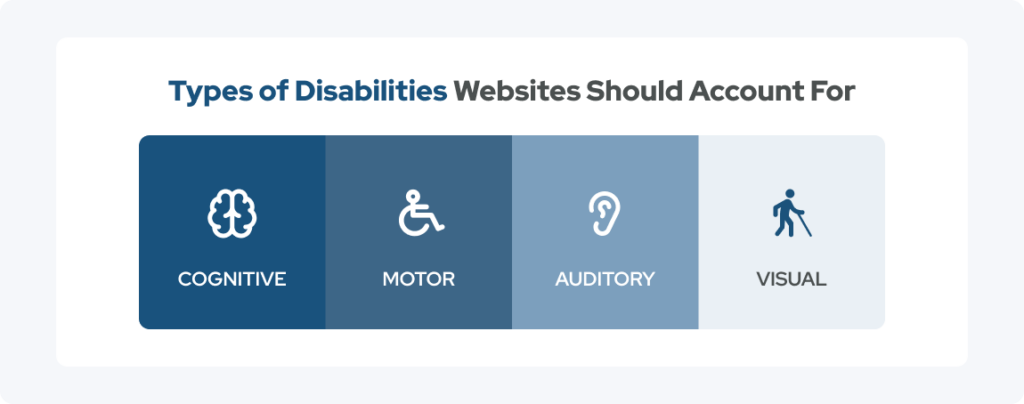
Even though they predominantly affect people with disabilities, website accessibility barriers can frustrate any user, especially if they are using mobile devices or operating under less-than-ideal browsing conditions.
Benefits of Boosting Website Accessibility
Making accessibility improvements often leads to a better overall experience for all users, which is why they are closely tied to performance and CRO. The table below outlines some of the benefits experienced by accessible websites and the measurable impact they can have on the overarching brand.
| Potential Benefit of Website Accessibility | How It Can Impact Your Business |
| Broader audience reach | More users can engage with your content |
| More time on site | Smoother user journeys lead to fewer drop-offs |
| Increased trust | Stronger brand credibility and inclusivity |
| More form completions | Accessible inputs improve usability and lead to more conversions |
In addition to the benefits above, making a website accessible to everyone can also support SEO performance, considering that a clean structure, readable content, and logical hierarchy make it easier for search engines to understand and index pages effectively.
To take advantage of these benefits, take a look at my tips for making your website accessible, which I have compiled during my time as a senior WordPress developer.
Top 5 Web Accessibility Tips Right Now
The following website accessibility tips reflect practical approaches that can significantly improve both usability and performance. Each one addresses a common barrier while supporting a more inclusive digital experience.
Tip #1: Use Elementor Accessibility Features for Inclusive Design
Elementor is a visual website builder that operates as a plugin within WordPress, the content management system I use most frequently. Elementor offers an easy-to-use drag-and-drop interface equipped with responsive design controls, structured layout systems, and customizable components that help ensure consistency across headings, buttons, and content elements, making it one of the most important website accessibility tools.
Plus, Elementor has Ally built in, which will give users access to an accessibility toolbar that allows them to do things like:
- Resize fonts
- Change the page to grayscale
- Show the page with negative or high contrast
- Show page with a light background
- Add underlining to links
- Change the font to be more readable
Although plugins like Elementor can make your website more accessible, you should still regularly review your templates and components to ensure they are as accessible as possible. Doing so can make you feel empowered and responsible for maintaining accessibility standards across the site.
Tip #2: Maintain Proper Color Contrast for Readability
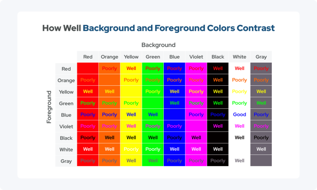
Color contrast refers to the difference between foreground elements, such as text, and their background. Low contrast can make content difficult or impossible to read, which is especially problematic for body text, buttons, calls to action, and navigation links.
Maintaining strong contrast throughout your site is critical for people with visual impairments, such as color blindness, as well as for users browsing on mobile devices, in bright environments, or with low screen brightness. Following WCAG contrast guidelines helps ensure content readability across all contexts.
Some practical tips include:
- Avoiding light text on light backgrounds
- Using darker text for body copy
- Testing buttons and links across different states
Additionally, you should validate color combinations early in the design process to guarantee they will pair well.
Tip #3: Allow Users to Toggle Animations and Reduce Motion
More developers are relying on animations to enhance a website’s visual appeal, which can be great, but it can also open the door to challenges, especially for users with motion sensitivity or vestibular disorders. When left unchecked, excessive motion can cause discomfort and distraction, making it difficult to focus on digital content.
A simple solution is to offer a “Reduce Motion” or animation toggle that respects users’ sensitivities by putting them in control of their experience, fostering trust and comfort. Elements that may require motion controls include:
- Parallax scrolling
- Animated transitions
- Auto-playing background visuals
Websites managed in WordPress can also be instructed to follow system preferences. So if a user has reduced motion enabled in their device settings, the site can automatically adjust animations accordingly.
As an added bonus, reducing unnecessary animation can also improve page performance by lowering resource demands.
Tip #4: Offer Light Mode and Dark Mode Options
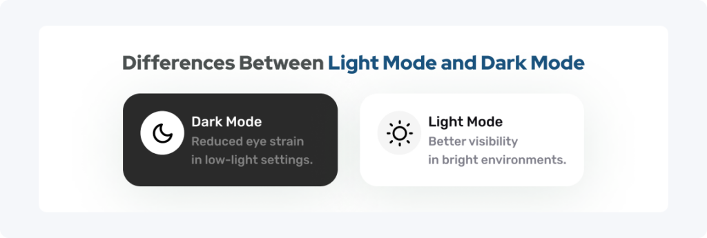
User preferences can vary based on lighting conditions, screen brightness, and their own visual sensitivity. For example, many users rely on dark mode to reduce eye strain in low-light environments and on light mode to improve visibility in bright conditions.
By providing both light and dark modes, developers can give users the power to choose the experience that feels most comfortable. Just as with system-wide reduced motion settings, websites managed in WordPress can also be configured to adapt to the user’s light or dark mode preferences, automatically loading the appropriate mode.
Developers should test light and dark modes carefully to ensure that text remains readable, contrast meets accessibility standards, and the visual hierarchy is preserved in both modes.
Tip #5: Use Semantic Headings for Screen Reader Navigation
Semantic headings provide structure to a webpage, helping all users understand the content hierarchy, especially those who rely on assistive technologies, since screen readers depend on headings such as H1s, H2s, and H3s to navigate pages efficiently.
Improper use of headings can disrupt this process and hinder the value of content. Some examples of common mistakes include:
- Skipping heading levels
- Using headings purely as stylistic elements
- Having multiple H1 tags without a clear structure
In my work, I use one clear H1 per page and organize content with logical H2 and H3 sections to maintain a consistent hierarchy. In addition to boosting accessibility, ensuring proper heading structure can also improve SEO and content clarity, making it easier for both users and search engines to interpret the page.
Additional Accessibility Practices to Consider
While the five tips above address major accessibility factors, there are many other steps developers can take to further improve inclusivity. Four additional ways developers can create a smoother and more intuitive user experience are:
- Adding descriptive alt text for images
- Ensuring forms include clear labels and instructions
- Designing large, clickable buttons
- Simplifying navigation menus
Don’t look at accessibility as a one-time checklist. Treat it as an ongoing effort that evolves alongside the websites you work on.
Building Accessibility Into Your Website Strategy
The website accessibility tools and tips I mentioned in this guide are most effective when built into your workflow from the very beginning. Some ways organizations should take a proactive approach include:
- Conducting regular accessibility audits
- Testing website accessibility with assistive technologies
- Training teams on accessibility standards
- Reviewing new content before publishing
Because websites are constantly evolving, ongoing monitoring is essential—new features, updates, and content can introduce accessibility issues if they are not carefully managed. You should be constantly testing website accessibility using tools like WAVE and then addressing any problems you encounter.
Creating Inclusive Digital Experiences for Every Visitor
If you incorporate the web accessibility tools and tips I provided, you can improve both user experience and business performance without sacrificing creativity or brand expression. All it takes are intentional design choices, such as ensuring proper contrast, strategically structuring content, including motion controls, and offering flexible display modes.
For the best results possible, turn to collystring. As an experienced marketing agency, we can ensure your website is accessible to everyone and help you achieve higher engagement, better visitor retention, and stronger conversion performance. We tie accessibility into broader performance strategies that extend beyond website design and development, leveraging our other services to ensure your website is not only navigable but also easily found by your target audience.
Connect with collystring to improve your website accessibility, enhance performance, and build a digital experience that works for every visitor.